Wednesday, 22 June 2011
album cover- first go on photoshop
Saturday, 18 June 2011

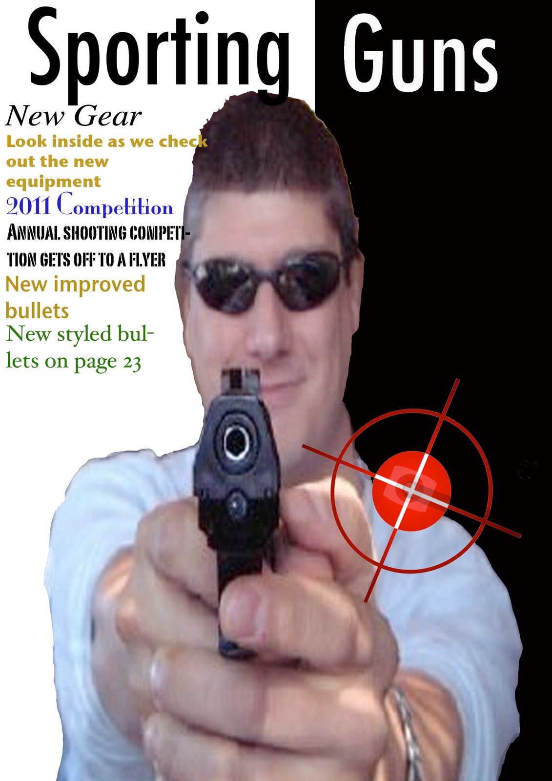
Here is where me and ric used photoshop for the first time, to see if we could make an advert for practise. Ric done most of the cutiing out, but i tried editing the colour, although i didnt know what i was doing, it still aloud me to get a rough overwiew of what to do. I think that it shows you the conventions that is needed to be in a magazine advert, with dates that will be holding competitions and new guns out. The image however is a bit ridged on the outline where its been cut, but it shows you the rough idea of how an advert can look. The black and white background works really well against the image centred in the middle. And the gun being pointed'almost at the viewer' works really well. As you can see, you can also add in images that will boost the representation of the theme. Thats done with the bullseye logo added in. This is coloured in red to contrast aginst the black background on the right. Overall it gives me a good initial starting point that i can try and improve on.
Sunday, 12 June 2011
introduction!
welcome to my A2 media project. In last years AS course i produced a film called flashback with myself, ric and luke. however for this years A2 project me and ricardo are going to be making a music video where we are hoping to get the best grade possible. We need to pick a song of our choice to use in our music video, and also need one to help us with what type of genre were looking at. we've looked at a variety of bands, and their videos to see what type of ideas they use in them. were looking at a pop funk type of song along the lines of 'two door cinema club'.
Subscribe to:
Comments (Atom)
