Showing posts with label ancillary task. Show all posts
Monday, 21 November 2011
magazine advert - analysis - basement jaxx
I decided to choose a slightly different type of advert here using one that is promoting a house/electro music. The album names is called 'rooty', which is clearly shown in the centre of the ad. Basement jaxx is written very brightly and used a mix range of colours, making it clearly stand out. All the key information is written in different types of font, making you look at each specific bit individually. You can clearly see the release date which is the 25 June. Another key point is that it relates from both the album cover and the advert. This means that it would be clearly recognisable. The actual theme of the advert is unusual, in the way that the picture doesn't relate to anything in particular. The colour scheme changes all over with it being white, red black and a mixed palette on the writing. The most important thing is that it draws your attention and is visually very attractive. The only way i think the image relates to the genre, is that house is really funky and fun, with a lot of beats, so the advert shows this with it being vibrant and fun.
magazine advertv - analysis - dizzee rascal
Dizzee rascals magazine advert is a very short but very effective. Its all really clear, with the background being bright pink. This Carry's on from his previous album tongue and cheek, which has a similar design. Dizzee rascal is situated in the bottom right, and is standing very strong and bold. This is connoting that he is exactly how he wants to be, and is his own style. The title is very clear, and is the biggest thing on the advert, as well as the album name. It works really as both texts are slightly different, and are in opposite colours, so stand out against each other. The date isn't entirely clear which doesn't help it at all as this is an advert that is meant to promote his album. It has a quote from a external source, which helps sell the album, as other sources are saying its good. The target audience is clear i think, as the colour is vibrant, and would reflect a young audience. Along with this, Dizzee rascal posture is one that young adults/teenagers would look similar to, so this would help get that across to the specific market. To add to this, he is wearing, baggy trousers, with a hoodie and trainers, which many young teenagers would relate to in that urban environment. It represents dizzee rascal very well, and gives the functions of n advert very well as well as adding good conventions, being similar what he would look like in his videos. Hopefully i can get these important points in my magazine advert.
magazine advert - analysis 1
Here i will be analysing one of three adverts to help me in making my own magazing advert at the end. Coldplay, who are a very known band have made a very effective advert here, with there being lots of information and having a solid image in the middle. It shows a clear represntation of their album, cover as it reflects a similar design to it. In relation to the functions, its very clear, showing who the band is, what their album is called and when its coming out. The image clearly shows the band members in coldplay, however it doesnt have a clear connection with the video or the settings so its not stereotypical in redflextion of the conventions. The advert is recognisable so people would be able to go out and buy it, kn owing exactly what it looks like. It doesnt give a easy view of who the target audience will be, apart from the fans that follow the band.
functions and conventions of an advert
Functions and conventions of music magazine adverts
While making our magazine advert we feel it is important to consider the functions and conventions of them and will do this by analysing them. First we discussed what they were. This will help us realise the key points when coming to our advert. It will make sure that we have the specific information thats needed with the conventions, and hopefully appeal to our target audience for our genre.
Functions are:
Conventions are:
While making our magazine advert we feel it is important to consider the functions and conventions of them and will do this by analysing them. First we discussed what they were. This will help us realise the key points when coming to our advert. It will make sure that we have the specific information thats needed with the conventions, and hopefully appeal to our target audience for our genre.
Functions are:
- To Promote the artist
- To sell the song
- To be eyecatching- visually striking
- Song/Album title
- Visual links to videos- Intertextuality
- Reviews (Newspaper, Music press, Celebrities/DJ's- Trend Setters)
- Condensed information on content
- Release date
- Artist name
- Where is it available to purchase (HMV,Amazon)
- Record label logo
Inside covers
Inside cover 1

Inside cover 2
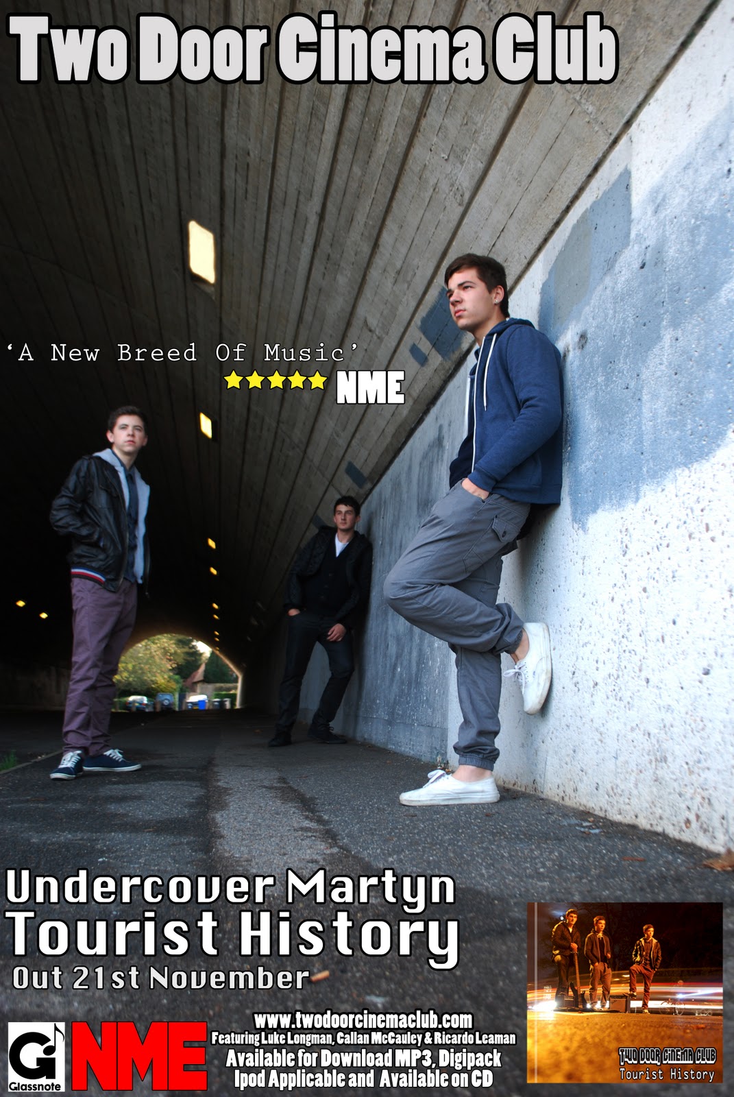
Above is the two inside covers for our Digipack. We made them nice and simple images, that just got across the same style as the front and back covers. We still wanted the lights that we had in the from and back to flow through, so we put one t=that we took, that was a tester to see if the idea would work. This made a really effective line of light that would look simple but interesting at the same time. The Inside cover 1 was used as it shows us in the same tunnel as the advert but captures the feet instead of the body. This is different as were all really close to the camera, so it makes an immediate impact. All 4 together i think make a really effective digipack.
Sunday, 20 November 2011
front and back of digipack
Front of Digipack
Back of Digipack
Above is the front and back of our digipack for the ancillary task. We took over 200 photos in different locations, seeing weather or not they looked good and what worked well. After taking photos in one location under a tunnel, the group kept thinking of new ideas so more and more photos were taken. We bought along some props in case we wanted to use them in the photo. As you can see before this post, we had a 3-4 photos that we picked out to use for editing in the digipack. This photo was chosen to edit, as there was a lot of originality to it and looked really effective with the light being dragged across the page. This was done with the camera set to a mode where more light is let in to the lens, making the actually shot to take around 5 seconds before capturing the image. This means that the movement of the light gets captured during these seconds. The front cd cover had the most light in it, making it look really effective against the dark background, so we chose this as the final image. We wanted to keep the same stlye throughout so we kept the back the same, in the way the light goes across the image, but this time we just had the instruments and props there. This worked really well as it gives you both side to the band with themselves and the things they play their music with. We also thought that the triangle at the front left makes the photo a whole lot better. It makes it look foreshortened, and draws all the objects together. I personally think this makes the whole imageWhen editing the image of the front and back cd cover, we made it look a bit clearer through the sharpen toll on adobe photoshop. We also adjusted the light of the photo. This was done to make the background darker, however keeping the faded image of the tree on the right, so it creates a better image. We used strokes on the image that touches up areas that photoshop may think are blurred at all. We kept both the moons that you can see in each image as this adds a good little touch to the photo and draws your attention to this. The overall setting that was chosen was because the title of the album cover is called tourist history, so taking the photo in a town, means we are trying to relate it to the original album cover giving it a bit more edge to it.
Friday, 18 November 2011
Magazine Advert

Wednesday, 16 November 2011
conventions of a digipack
After looking at cd covers and seeing what is on them, i decideed to see what is exspected to be on a digipack. These include codes and conventions of a digipak and what I would need to include to make a professional and realistic representation. I looked at the existing market for digipaks, seeing what would be included, such as photographs, band information etc. I also noted that the majority of digipaks are created for special or limited edition disks and DVD's of gigs/concerts.
Conventions That must be included in a Digipak :
- Visuals are key to the production - Includes images of the artist/band, shots from concerts, instruments, etc.
- Band/ artist name and album title, making the brand easily identified. Can be included along the spine and on main cover.
- List of songs included, or if for a DVD scene selection.
- Basic information about the artist/band - background information, type of music, etc.
- Reviews from newspapers - Good reviews are often printed on the back cover to encourage sales and marketing.
Monday, 14 November 2011
picking 3 we liked
After taking over 200 photos for are digipack, we needed to cut down to at least three final possible outcomes. We looked at these three photos and came to a conclusion that this would be the best one. These are ones that we wanted to use for the front cover of our digipack. We chose the first one as this gave the best impression of the indie genre. It also has the best framing, and the colours of the cars stretched across the page with the dark night really looks effective. As you can see the original photo you can see how e will edit it when we use it for the front cover.
Saturday, 12 November 2011
digipack's we firstly looked at
Above is two cd front covers that I initially looked at as good starting point to use as a cd cover. The reasons behind these two were because the actually image firstly looked good. I also like how the people in the images are laid out. They both are very different with the kooks being really small in the corner and noah and the whjale covering the whole canvas. The bottom one has been taken with the back three members burred out while the front right person is clear. I think this resembles the lead singer of the band, something that could be useful when taking ours. The kooks cover is slightly different with the image being alot darker and having much more space. All the memebers are blurred out slightly, but it creates a very original, relaxed cd cover that is good to look at when making our digipack.
Thursday, 15 September 2011
Anicillary Task - Planning
Above is the plan for our Ancillary task. We had to use this to make our ancillary task succesful. It includes what track we were going to do, what artist, and the genre we were looking at. It mentions a short profile of the band that notes 'An indie/rock band formed in 2007, that consists of 3 members' etc. We also had to give breif ideas of what we were looking to do in our digipack, and the same with our magazine advert. Its an overall look at what our original ideas were for the ancillary task.
Monday, 18 July 2011
analyse album cover - Chase and Status - No more idols
Chase and status are an electronic music production duo from London. It consists of Saul Milton and Will Kennard. MC Rage & Andy Gangadeen also makes up the live band when performing. They formed in 2003 where they produced various tracks with record labels such as renegade hardware. There debut album 'more than a lot' came 49th in the charts in 2008. However in 2009 it got best album for the drum and bass awards. Their latest album 'no more idols' was released 28th January 2011. It represents their major full-length release since 'more than a lot', where they signed a massive deal with jay z's roc nation label. There album cover (image shown) is very straightforward and simple but gives an immediate impact. They have used one dominant image that covers the whole cd cover. The picture is focused on the dog, with the background out of focus, which again makes it stand out a lot clearer. The bulldog is in black and white, and i think this represents the title of the album as such a strong 'dog' that doesn’t need idols. Being black and white, the yellow writing stands out perfectly, making it so clear of who they are when looking at the cover. Its almost as if the dogs looking down on the writing, although this may be coincidence It still creates a very good overall cd cover that many would buy.
Thursday, 7 July 2011
CD cover analyse - Two door cinema club - Tourist History
My second choice for a Cd cover is the artist that my group are actually looking into. Im looking at this because it will be good to see the nway they have made the cd cover, in comparison to the cover we will make. Its very unusual to what some artists have domne, but it works very well. They have kept it consistant keeping the 'o's and 'c's in the name all the same. Theve been really creative with the way its laid out as well. They have put an image of the cat coming i n from the bottom right hand corner. The 'o's circle the mainobjects on the cat, which are the eyes and main part of the crown. I dont think it has any relevance to the name of the album but it looks really effective, and works well as a CD cover. The writing is also very clear which helps as you vcamn clearly see the bands name, due to it being clear white and fairly bold. When making our CD cover, we will be looking to look for somethink that is creative like this one, but is also unique.
Wednesday, 22 June 2011
album cover- first go on photoshop
Saturday, 18 June 2011

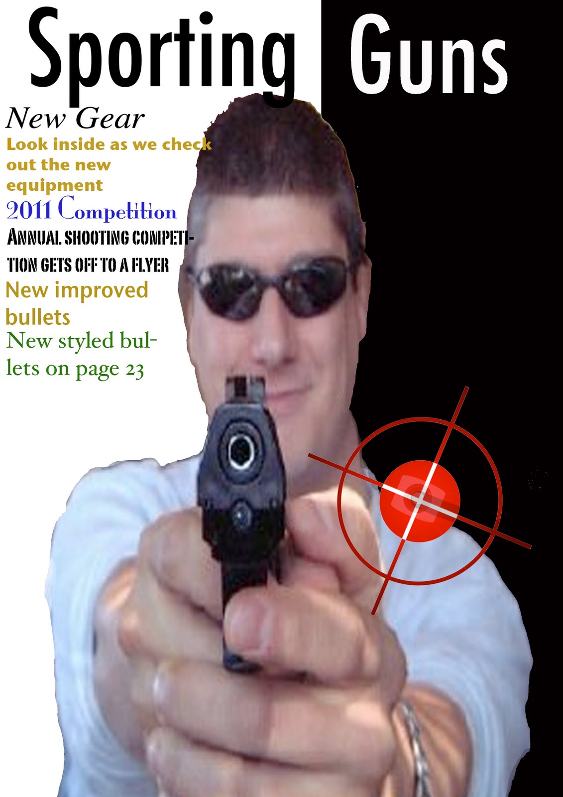
Here is where me and ric used photoshop for the first time, to see if we could make an advert for practise. Ric done most of the cutiing out, but i tried editing the colour, although i didnt know what i was doing, it still aloud me to get a rough overwiew of what to do. I think that it shows you the conventions that is needed to be in a magazine advert, with dates that will be holding competitions and new guns out. The image however is a bit ridged on the outline where its been cut, but it shows you the rough idea of how an advert can look. The black and white background works really well against the image centred in the middle. And the gun being pointed'almost at the viewer' works really well. As you can see, you can also add in images that will boost the representation of the theme. Thats done with the bullseye logo added in. This is coloured in red to contrast aginst the black background on the right. Overall it gives me a good initial starting point that i can try and improve on.
Subscribe to:
Posts (Atom)