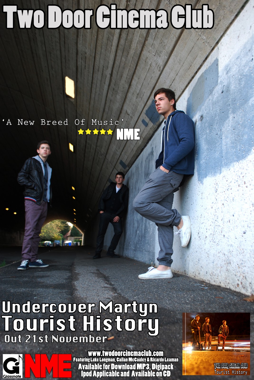
Here i have uploaded our magazine advert which me and my group all chose as we felt this would appeal the most as an avert image. The image itself is very good, as the framing is well spread out, with us in three different positions allowing there to be lots of different writing to be added in. We used adobe photoshop to help edit the photograph, by making it look slightly darker and adding in an additional light, so that it gets brighter the closer the lights get. we made sure the band name was the boldest, as this is the most important thing in the advert, which is shown at the top of the magazine. I think that this advert shows all the key details that is needed to be shown in the advert. We put both front and back of the cd covers to help promote us as a band. We added the promoters name which is NME, and put glassnote logo's on it as they are the record company of two door cinema club. The last thing we added was the website address, stating that the album can be down loaded on a certain date. The actual setting is really crucial as well. Again using the urban environment it helps show the genre of the band, and help target the right audience.


No comments:
Post a Comment