Sunday, 20 November 2011

front and back of digipack


Front of Digipack


Back of Digipack

Above is the front and back of our digipack for the ancillary task. We took over 200 photos in different locations, seeing weather or not they looked good and what worked well. After taking photos in one location under a tunnel, the group kept thinking of new ideas so more and more photos were taken. We bought along some props in case we wanted to use them in the photo. As you can see before this post, we had a 3-4 photos that we picked out to use for editing in the digipack. This photo was chosen to edit, as there was a lot of originality to it and looked really effective with the light being dragged across the page. This was done with the camera set to a mode where more light is let in to the lens, making the actually shot to take around 5 seconds before capturing the image. This means that the movement of the light gets captured during these seconds. The front cd cover had the most light in it, making it look really effective against the dark background, so we chose this as the final image. We wanted to keep the same stlye throughout so we kept the back the same, in the way the light goes across the image, but this time we just had the instruments and props there. This worked really well as it gives you both side to the band with themselves and the things they play their music with. We also thought that the triangle at the front left makes the photo a whole lot better. It makes it look foreshortened, and draws all the objects together. I personally think this makes the whole imageWhen editing the image of the front and back cd cover, we made it look a bit clearer through the sharpen toll on adobe photoshop. We also adjusted the light of the photo. This was done to make the background darker, however keeping the faded image of the tree on the right, so it creates a better image. We used strokes on the image that touches up areas that photoshop may think are blurred at all. We kept both the moons that you can see in each image as this adds a good little touch to the photo and draws your attention to this. The overall setting that was chosen was because the title of the album cover is called tourist history, so taking the photo in a town, means we are trying to relate it to the original album cover giving it a bit more edge to it.

Saturday, 19 November 2011

Logos we used


Above is the logos that we used in any of the coursework. The glassnote records logo was used in the magazine advert. This was because they are the label that two door cinema club are signed with, so it made our advert look more professional. It also helped target the right audience as people can see that the band are signed with them, so will draw the indie fans towards the advert. The nme logos were used in both the magazine advert and the final music video. The 'NME' logo for the advert was used as they promote two door cinema club, and this is helping the conventions, meaning people will realise who they are. The 'NMEtv' logo was used in the video, as it represents that its being played on nme's tv music program. It makes the video look more professional, and helps represent the genre of the indie band. 

Friday, 18 November 2011

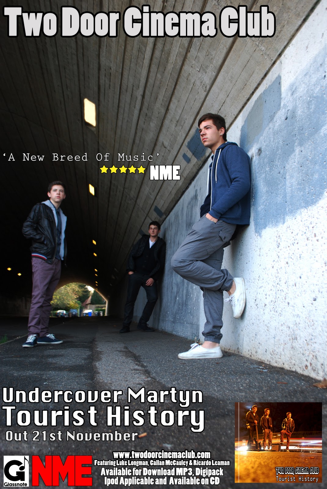
Magazine Advert

Here i have uploaded our magazine advert which me and my group all chose as we felt this would appeal the most as an avert image. The image itself is very good, as the framing is well spread out, with us in three different positions allowing there to be lots of different writing to be added in. We used adobe photoshop to help edit the photograph, by making it look slightly darker and adding in an additional light, so that it gets brighter the closer the lights get. we made sure the band name was the boldest, as this is the most important thing in the advert, which is shown at the top of the magazine. I think that this advert shows all the key details that is needed to be shown in the advert. We put both front and back of the cd covers to help promote us as a band. We added the promoters name which is NME, and put glassnote logo's on it as they are the record company of two door cinema club. The last thing we added was the website address, stating that the album can be down loaded on a certain date. The actual setting is really crucial as well. Again using the urban environment it helps show the genre of the band, and help target the right audience.

Wednesday, 16 November 2011

conventions of a digipack

After looking at cd covers and seeing what is on them, i decideed to see what is exspected to be on a digipack. These include codes and conventions of a digipak and what I would need to include to make a professional and realistic representation. I looked at the existing market for digipaks, seeing what would be included, such as photographs, band information etc. I also noted that the majority of digipaks are created for special or limited edition disks and DVD's of gigs/concerts.

Conventions That must be included in a Digipak :
  • Visuals are key to the production - Includes images of the artist/band, shots from concerts, instruments, etc.
  • Band/ artist name and album title, making the brand easily identified. Can be included along the spine and on main cover.
  • List of songs included, or if for a DVD scene selection.
  • Basic information about the artist/band - background information, type of music, etc.
  • Reviews from newspapers - Good reviews are often printed on the back cover to encourage sales and marketing.

Monday, 14 November 2011

picking 3 we liked


After taking over 200 photos for are digipack, we needed to cut down to at least three final possible outcomes. We looked at these three photos and came to a conclusion that this would be the best one. These are ones that we wanted to use for the front cover of our digipack. We chose the first one as this gave the best impression of the indie genre. It also has the best framing, and the colours of the cars stretched across the page with the dark night really looks effective. As you can see the original photo you can see how e will edit it when we use it for the front cover.

Saturday, 12 November 2011

digipack's we firstly looked at


Above is two cd front covers that I initially looked at as good starting point to use as a cd cover. The reasons behind these two were because the actually image firstly looked good. I also like how the people in the images are laid out. They both are very different with the kooks being really small in the corner and noah and the whjale covering the whole canvas. The bottom one has been taken with the back three members burred out while the front right person is clear. I think this resembles the lead singer of the band, something that could be useful when taking ours. The kooks cover is slightly different with the image being alot darker and having much more space. All the memebers are blurred out slightly, but it creates a very original, relaxed cd cover that is good to look at when making our digipack.

Locations for new video

Locations
Above is a presentation of the different locations we went to film. we decided as a group that these locations would be best to film at because we had originally used similar scenes for our cd cover, and it also related best for our storyboards. We used the areas around windsor leisure centre which are urban and relate well to the target audience, which is for predominantly males between the ages of 17-30. The reasons we chose the urban environment was to make the band look original and allow it to look as if they are a small band that love their music. This is shown through the 4 different locations that are the riverside, tunnel, motorway and side street.